The squircle explained: Mathematical design theory and real-world applications

From the sleek icons on your smartphone to the subtle curves of modern architecture, one shape has quietly become a staple in modern design, the squircle. A mathematical fusion of a square and a circle, the squircle combines the precision of geometry with the fluidity of curves. But it's more than just visually appealing, it's ergonomic, functional, and increasingly central to user interface design.
This deep dive will explore the mathematical foundations of the squircle, its real-world applications in products from Apple, Samsung and Google, and the key reasons why this unique shape has revolutionised digital and physical design. Whether you're a designer, developer, or curious enthusiast, understanding the squircle can sharpen your eye and enhance your work.
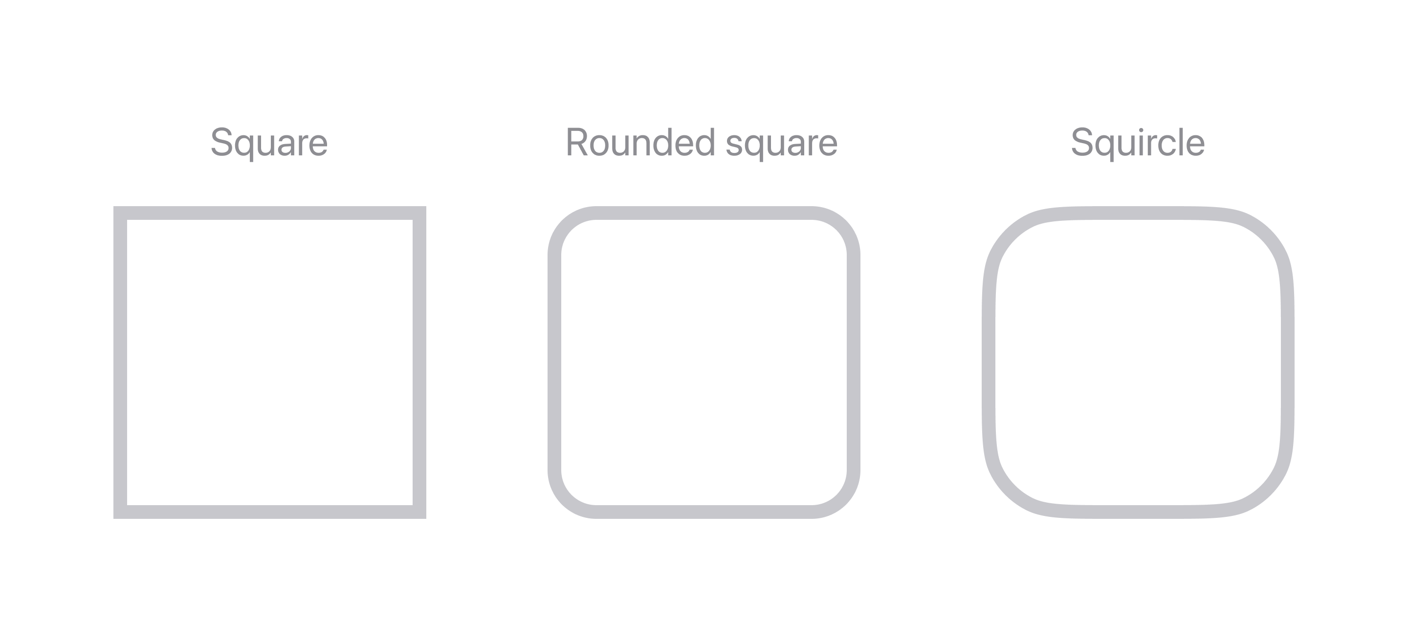
What is a squircle?
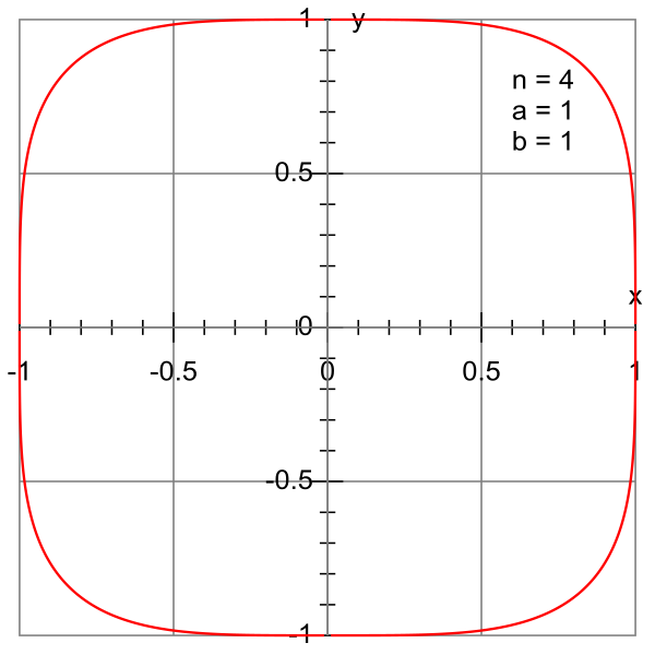
The squircle originates from the superellipse, also known as the Lamé curve. This elegant mathematical shape is defined by the formula:
When the values of a and b are equal and n is set to 4, the result is a geometric figure that seamlessly blends the rigid corners of a square with the continuous curves of a circle. The equation becomes:
This transformation smooths out the corners while preserving the balance and symmetry of both foundational shapes. The squircle is not only aesthetically pleasing but also mathematically stable, which is why it's been widely adopted in both digital and physical design domains. Its ability to maintain harmony between rigidity and softness makes it ideal for modern design challenges.
See also MathWorld and Wikipedia.
How the squircle took over modern design
The squircle was first introduced to the world of design by Danish polymath Piet Hein, who used it in an architectural project in Scandinavia. What began as a mathematically satisfying shape soon found its place in digital and industrial design. As screens shrank, and user expectations grew, designers sought shapes that were both space efficient and visually approachable. The squircle became a natural solution.
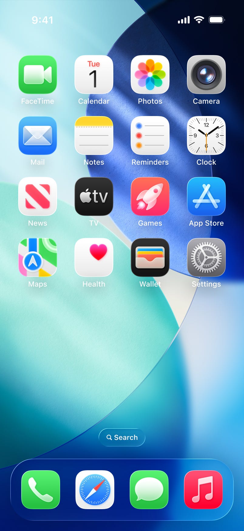
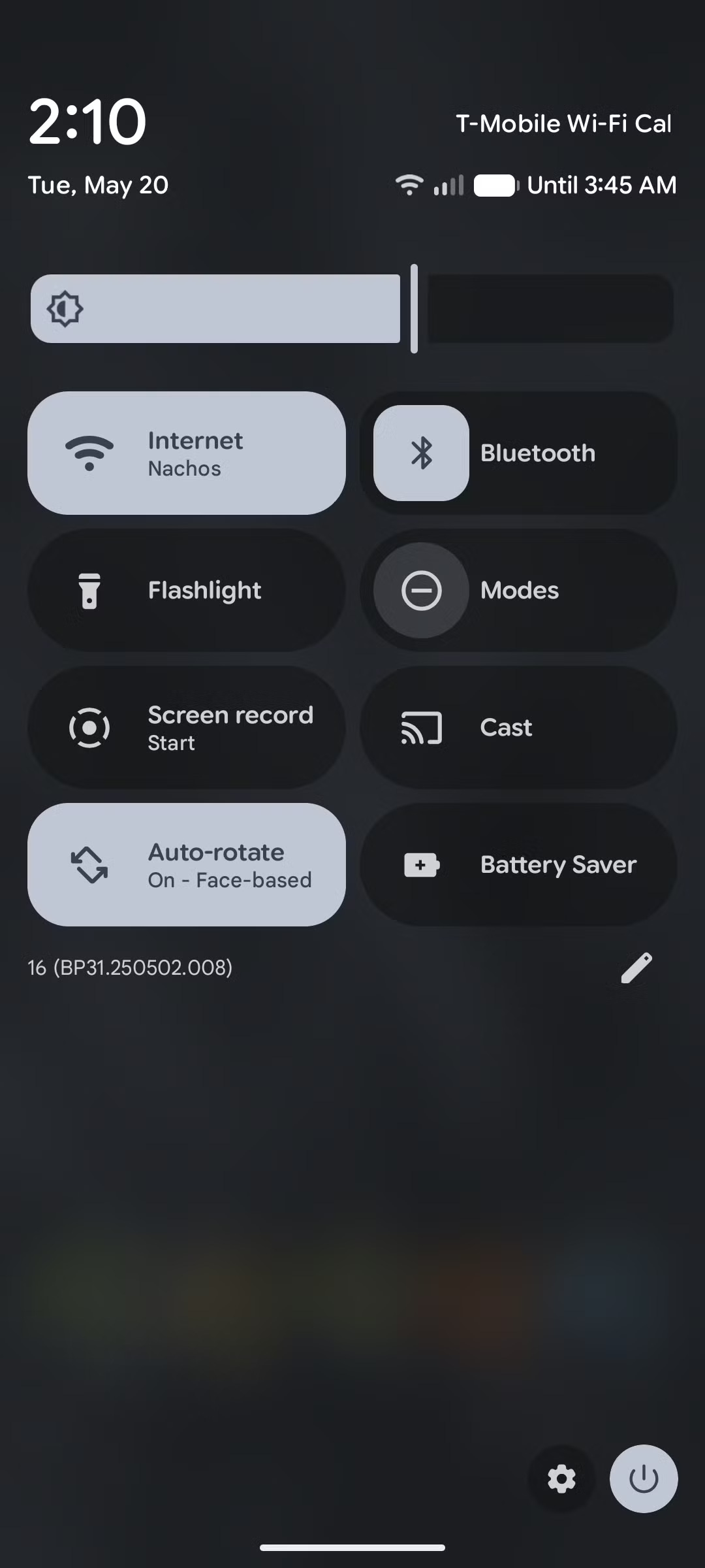
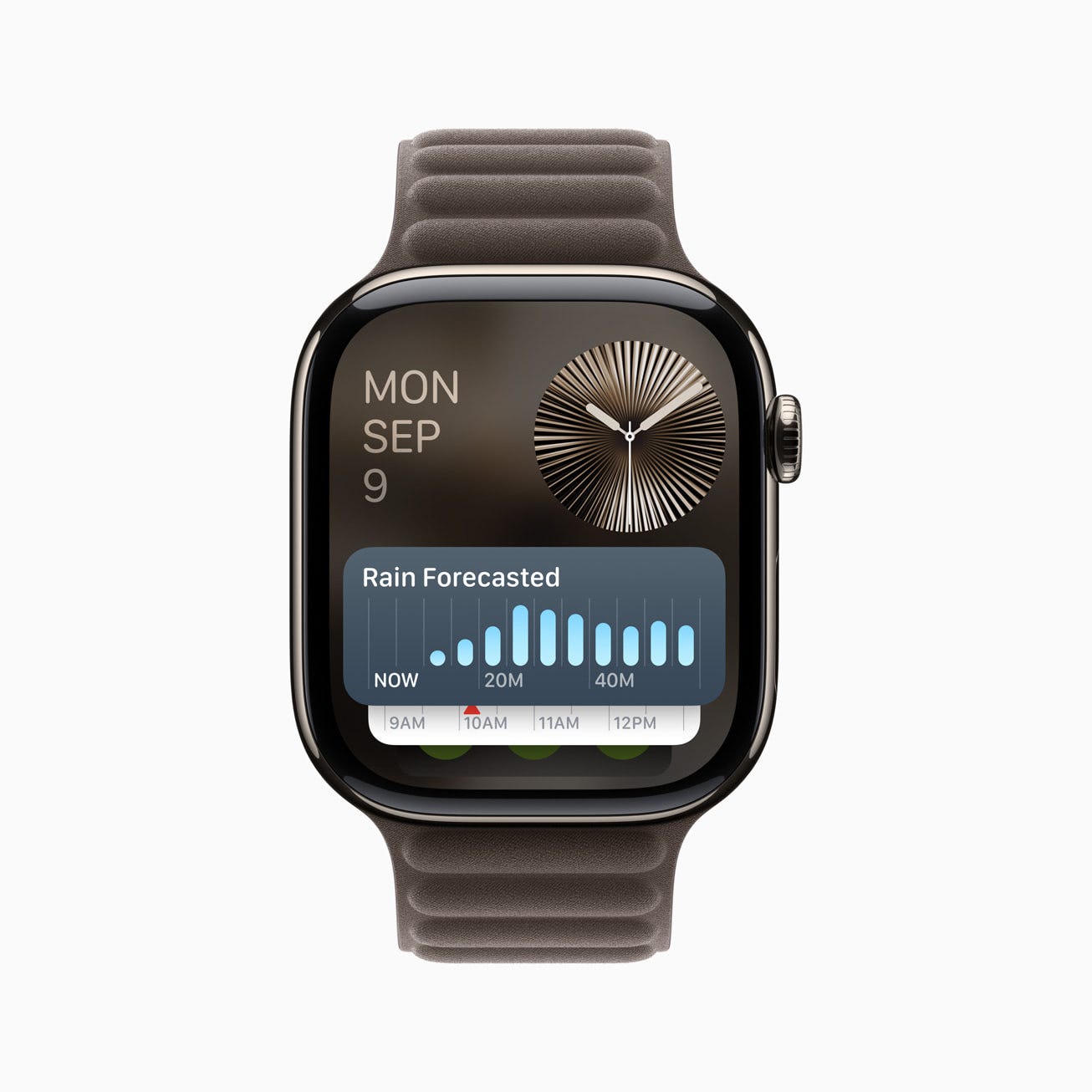
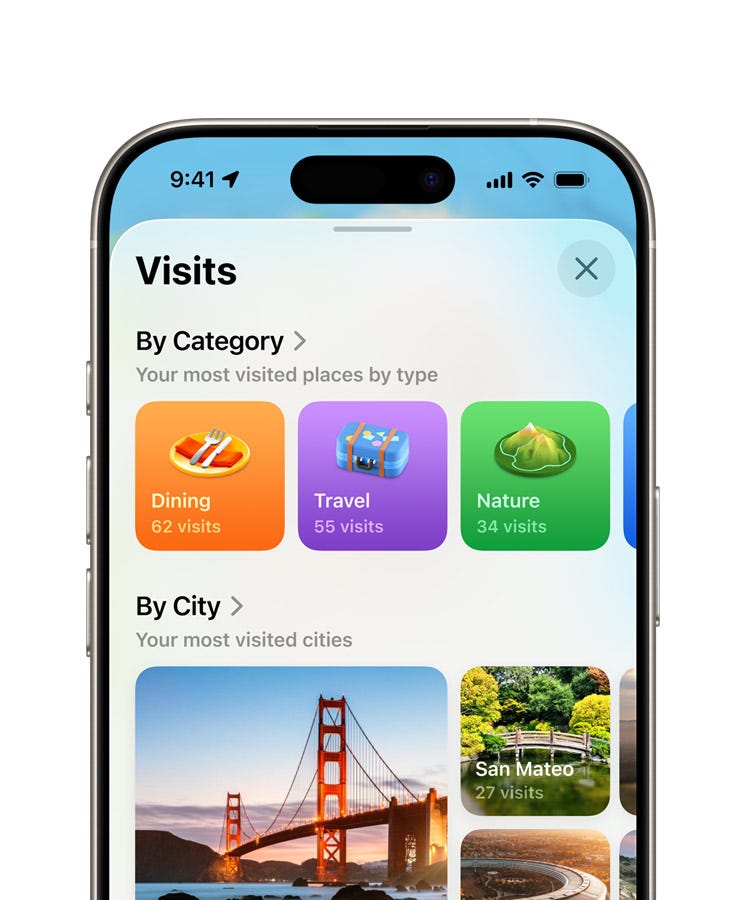
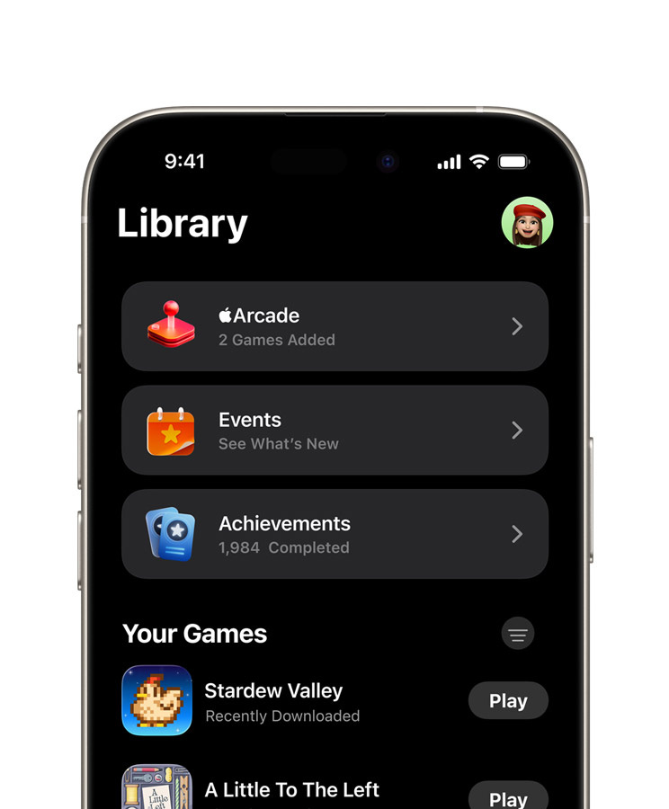
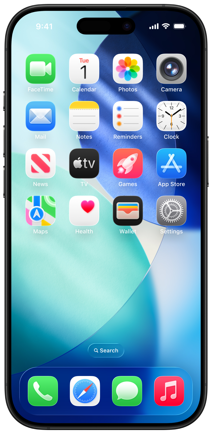
Tech giants quickly recognised the value of this form. Apple, for instance, uses a variation of the superellipse for its app icons, software buttons, and even hardware such as the Apple Watch interface. The soft edges not only create a friendlier look but also enhance the user experience by reducing visual tension.
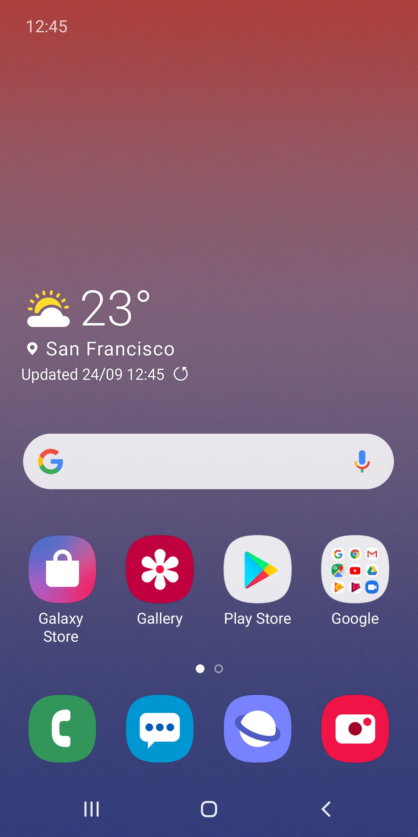
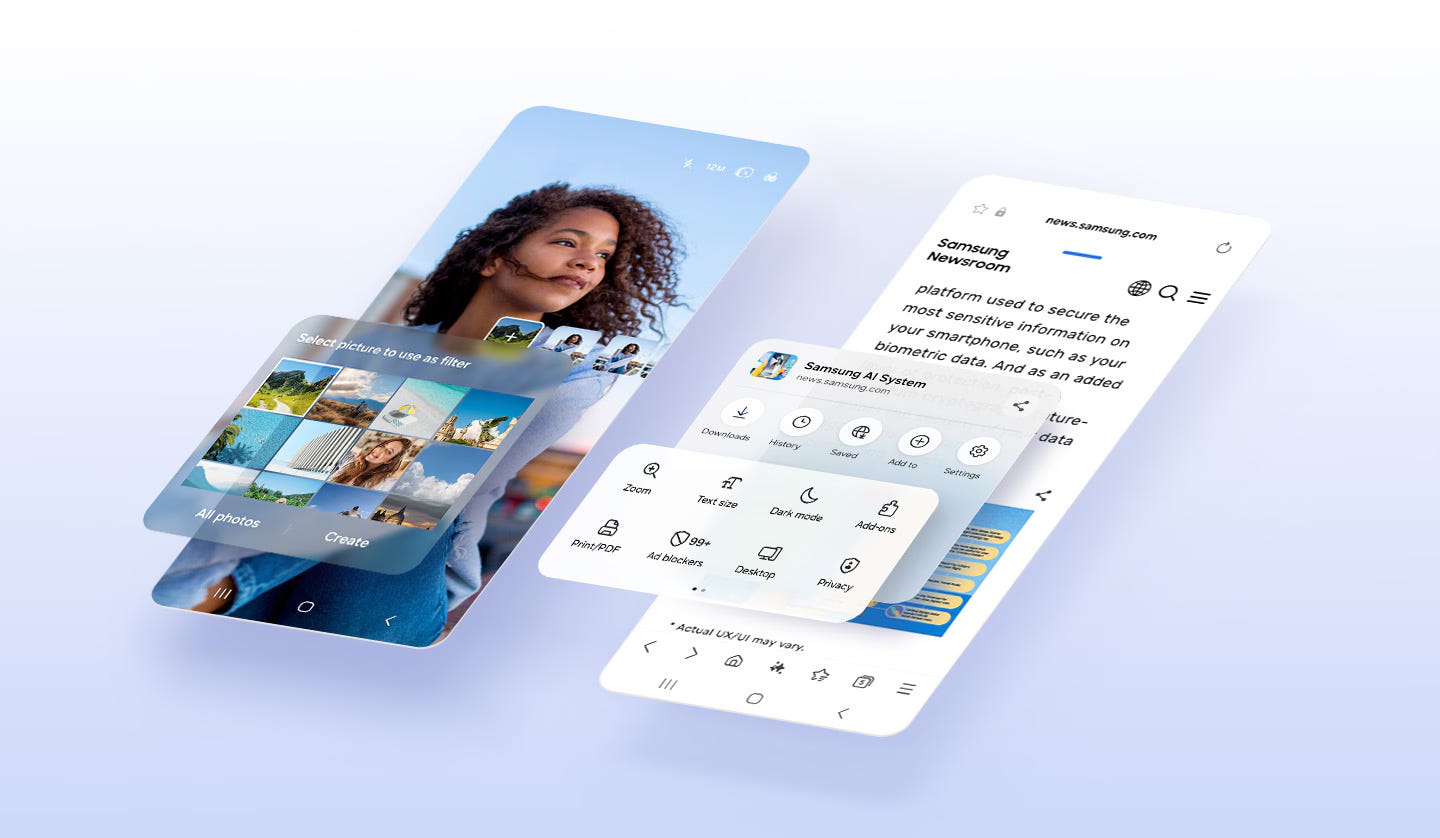
Samsung adopted squircles extensively in its One UI design system. By doing so, the company created a more intuitive and accessible interface, particularly on large-screen mobile devices. The shape guides the user’s eye with ease and helps differentiate key interactive elements without harsh contrasts.
Similarly, Android began integrating squircles into its design language with the release of Android Oreo. Its adaptive icon system uses a squircle mask to unify various app icon shapes across different manufacturers, creating a more cohesive and polished user interface.
These implementations have helped establish the squircle not just as a stylistic trend but as a strategic design element that improves usability, coherence, and brand.

Why squircles feel better: The ergonomic advantage
While aesthetics are important, the squircle's popularity also stems from its superior ergonomic qualities. Unlike sharp-cornered squares, which can feel rigid or jarring, and circles, which sometimes lack visual weight or structure, the squircle strikes a perfect balance. Its rounded edges naturally guide the user, enhancing comfort in both visual and tactile interactions.
Design elements shaped like squircles tend to reduce cognitive load. Their familiar yet distinctive silhouette allows users to quickly recognise buttons, icons, and interface containers. This is especially useful on smaller screens, where space is at a premium and clarity is critical.
Take the Apple Watch as an example. Its interface relies heavily on squircle shapes to organise the interface and interactions. Despite the device’s compact display, users find it easy to navigate due to the visual comfort and clarity that squircles provide.
Samsung's One UI also benefits from squircle buttons and cards, which support thumb-friendly design and natural interaction flow, especially on edge-to-edge screens.
Maximising space: Squircle geometry and layout efficiency
Another major benefit of the squircle lies in its spatial efficiency. Traditional circular buttons and icons often waste space around their edges, especially when arranged in a grid. Squares, on the other hand, use space more efficiently but can feel harsh or overly rigid. The squircle offers the best of both worlds.
By combining curvature with structural boundaries, the squircle provides a more generous area for content without expanding the element's footprint. This becomes especially important in mobile and web interfaces where real estate is limited. Squircles help designers present content more effectively, enabling larger, more tappable areas that feel both substantial and elegant.
Android's adaptive icon system exemplifies this principle. By applying a squircle mask to icons, ensures consistency across devices and resolutions. App icons retain their unique branding while fitting cohesively into a universal container. This not only enhances visual harmony but also simplifies interaction by making targets easier to tap.

Supporting visual hierarchy and interface clarity
In addition to comfort and efficiency, the squircle enhances visual hierarchy and clarity in digital interfaces. Its gentle curves attract attention without being overbearing, making it ideal for high-priority elements such as primary actions, navigation buttons, or user avatars.
Unlike circles, which are often perceived as neutral or static, squircles convey subtle emphasis. Their shape gives them presence on the screen while still blending well with other design elements. This makes them highly effective for grouping content or creating an intuitive flow in a user journey.
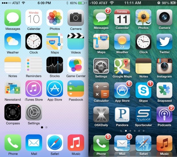
Apple's iOS home screen is a prime example of this design principle in action. By using a uniform grid of squircle icons, the interface ensures visual consistency and enhances the user's ability to scan and identify apps quickly. This approach not only improves usability but also reinforces Apple's clean and approachable brand aesthetic.
How to create squircles: Tools for designers and developers
Designers and developers looking to integrate squircles into their work have access to a growing set of tools and techniques. For quick approximations, CSS offers the border-radius: 25% / 20% property, which creates a shape close to a squircle. However, for pixel-perfect results, especially in logos or precise UI elements, SVG paths can be used to draw mathematically accurate curves.
Software tools like Figma and Adobe Illustrator also support squircles through dedicated plugins such as Squircle and Squircle Generator. These allow for greater control over curvature, enabling designers to fine-tune the appearance of their elements. Figma has a native feature called Corner Smoothing which allows to replicate the squircle without a plugin.
For developers and generative artists, programming libraries in Python, JavaScript, and Processing can generate squircles dynamically. These are particularly useful in data visualisation, animation, or algorithmic design applications where consistency and precision are essential.
The squircle’s staying power in design
Far from being a passing trend, the squircle has proven its longevity by solving real design problems. It bridges the gap between mathematical elegance and human-centric function. As our interfaces become more immersive and our devices more compact, the squircle's ability to convey comfort, clarity, and cohesion becomes increasingly valuable.
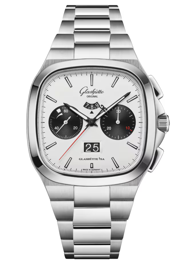
We can see squircles influencing not just user interfaces and wearables, but also in industrial and architectural design. Their use in jewellery, appliances, furniture, and even urban planning suggests a wider cultural adoption grounded in the shape’s intuitive appeal.
With its adaptable geometry, ergonomic benefits, and ability to support scalable systems, the squircle is well-positioned to remain a cornerstone of modern design across industries.
Final thoughts: A subtle shape with powerful impact
Next time you unlock your smartphone or glance at your smartwatch, take a moment to notice the shapes that frame your experience. From icons to buttons to interface containers, they shape not only how things look, but how they feel.
Whether you're working on your next design project, prototyping a physical product, or exploring visual languages, the squircle offers a versatile and meaningful design solution. It invites clarity, improves interaction, and enhances the user journey through form and function.
Further reading
For readers interested in diving deeper into the mathematical and philosophical principles behind the squircle and its design relevance, consider the following:
"The Superellipse: A Curve and Its Applications" by Piet Hein. This foundational text by the Danish mathematician and designer who popularised the superellipse explores its geometry and aesthetic applications in architecture and design.
"The Laws of Simplicity" by John Maeda. A concise and insightful book that explores the intersection of simplicity, technology, and design, including the power of shape and form in user experience.
"Geometry of Design: Studies in Proportion and Composition" by Kimberly Elam. An exploration of how mathematical ratios, including superellipses and golden proportions, are used in visual design.
"Designing Interfaces" by Jenifer Tidwell. A practical guide to interface patterns and design principles, including shape language, affordance, and interaction ergonomics.
"The Elements of User Experience" by Jesse James Garrett. Offers a strategic view of design thinking and visual communication, helping contextualise why elements like the squircle matter in the broader user experience.
Image credits
Image 1, by AnonMoos via Wikipedia
Image 2, by Fiat
Images 3, 5, 7, by Apple
Image 4, by Samsung
Image 6, by Android
Image 8, by Glashuette